One of the many great tools available in Inkscape is the Calligraphy tool. This tutorial will help you become acquainted with how that tool works, as well as demonstrate some basic techniques of the art of Calligraphy.
History and Styles
Going by the dictionary definition, calligraphy means "beautiful writing" or "fair or elegant penmanship". Essentially, calligraphy is the art of making beautiful or elegant handwriting. It may sound intimidating, but with a little practice, anyone can master the basics of this art.
The earliest forms of calligraphy date back to cave-man paintings. Up until roughly 1440 AD, before the printing press was around, calligraphy was the way books and other publications were made. A scribe had to handwrite every individual copy of every book or publication. The handwriting was done with a quill and ink onto materials such as parchment or vellum. The lettering styles used throughout the ages include Rustic, Carolingian, Blackletter, etc. Perhaps the most common place where the average person will run across calligraphy today is on wedding invitations.
There are three main styles of calligraphy:
-
Western or Roman
-
Arabic
-
Chinese or Oriental
This tutorial focuses mainly on Western calligraphy, as the other two styles tend to use a brush (instead of a pen with nib), which is not how our Calligraphy tool currently functions.
One great advantage that we have over the scribes of the past is the command: If you make a mistake, the entire page is not ruined. Inkscape's Calligraphy tool also enables some techniques which would not be possible with a traditional pen-and-ink.
Hardware
You'll get the best results if you use a tablet and pen (e.g. Wacom). However, even with mouse you can do some beginning calligraphy, though you will have difficulty producing fast sweeping strokes.
Inkscape does not yet use pressure sensitivity of a tablet pen, but that's not a problem because a traditional calligraphy pen (unlike a brush) is also not very sensitive to pressure. Inkscape calligraphy pen can be sensitive to the velocity of the stroke (see "Thinning" below), so if you are using a mouse, you'll probably want to zero this parameter.
Calligraphy Tool Options
Switch to the Calligraphy tool by pressing Ctrl+F6 or by clicking on its toolbar button. On the top toolbar, you will notice there are 6 options: Width & Thinning; Angle & Fixation; and Mass & Drag.

Width & Thinning
This pair of options control the width of your pen. The width can vary from 0 to 1 and is measured in units relative to the size of your editing window, but independent of zoom. This makes sense, because the natural "unit of measure" in calligraphy is the range of your hand's movement, and it is therefore convenient to have the width of your pen nib in constant ratio to the size of your "drawing board" and not in some real units which would make it depend on zoom.
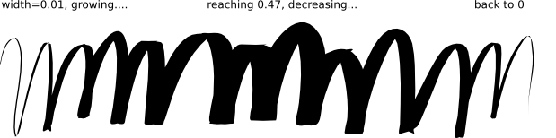
Since pen width is changed often, you can adjust it without going to the toolbar, using the left and right arrow keys. The best thing about these keys is that they work while you're drawing, so you can change the width of your pen gradually in the middle of the stroke:
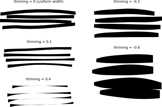
Pen width may also depend on the velocity, as controlled by the thinning parameter. This parameter can take values from -1 to 1; zero means the width is independent of velocity, positive values make faster strokes thinner, negative values make faster strokes broader. The default of 0.1 means moderate thinning of fast strokes. Here are a few examples, all drawn with width=0.2 and angle=90:
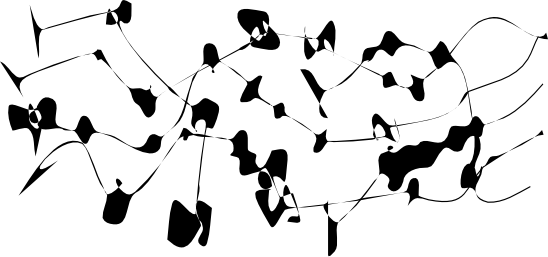
For fun, set Width and Thinning both to 1 (maximum) and draw with jerky movements to get strangely naturalistic, neuron-like shapes:
Angle & Fixation
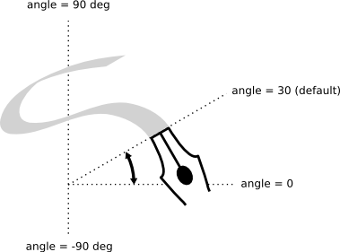
After width, angle is the most important calligraphy parameter. It is the angle of your pen in degrees, changing from 0 (horizontal) to 90 (vertical counterclockwise) or to -90 (vertical clockwise):
Each traditional calligraphy style has its own prevalent pen angle. For example, the Unicial hand uses the angle of 25 degrees. More complex hands and more experienced calligraphers will often vary the angle while drawing, and Inkscape makes this possible by pressing up and down arrow keys. For beginning calligraphy lessons, however, keeping the angle constant will work best. Here are examples of strokes drawn at different angles (fixation = 1):
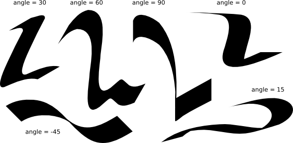
As you can see, the stroke is at its thinnest when it is drawn parallel to its angle, and at its broadest when drawn perpendicular. Positive angles are the most natural and traditional for right-handed calligraphy.
The level of contrast between the thinnest and the thickest is controlled by the fixation parameter. The value of 1 means that the angle is always constant, as set in the Angle field. Decreasing fixation lets the pen turn a little against the direction of the stroke. With fixation=0, pen rotates freely to be always perpendicular to the stroke, and Angle has no effect anymore:
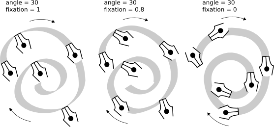
Typographically speaking, maximum fixation and therefore maximum stroke width contrast (above left) are the features of antique serif typefaces, such as Times or Bodoni (because these typefaces were historically an imitation of fixed-pen calligraphy). Zero fixation and zero width contrast (above right), on the other hand, suggest modern sans serif typefaces such as Helvetica.
Mass & Drag
Unlike width and angle, these two last parameters define how the tool "feels" rather than affect its visual output. So there won't be any illustrations in this section; instead just try them yourself to get a better idea.
In physics, mass is what causes inertia; the higher the mass of the Inkscape calligraphy tool, the more it lags behind your mouse pointer and the more it smoothes out sharp turns and quick jerks in your stroke. By default this value is quite small (0.02) so that the tool is fast and responsive, but you can increase mass to get slower and smoother pen.
Drag is the resistance of the paper to the movement of the pen. The default is at maximum (1), and lowering this parameter makes paper "slippery": if the mass is big, the pen tends to run away on sharp turns; if the mass is zero, low drag makes the pen to wiggle wildly.
Calligraphy examples
Now that you know the basic capabilities of the tool, you can try to produce some real calligraphy. If you are new to this art, get yourself a good calligraphy book and study it with Inkscape. This section will show you just a few simple examples.
First of all, to do letters, you need to create a pair of rulers to guide you. If you're going to write in a slanted or cursive hand, add some slanted guides across the two rulers as well, for example:
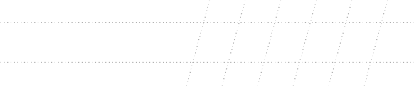
Then zoom in so that the height between the rulers corresponds to your most natural hand movement range, adjust width and angle, and off you go!
Probably the first thing you would do as a beginner calligrapher is practice the basic elements of letters ‚€” vertical and horizontal stems, round strokes, slanted stems. Here are some letter elements for the Unicial hand:
Several useful tips:
-
If your hand is comfortable on the tablet, don't move it. Instead, scroll the canvas (Ctrl+arrow keys) with your left hand after finishing each letter.
-
If your last stroke is bad, just undo it (Ctrl+Z). However, if its shape is good but the position or size are slightly off, it's better to switch to Selector temporarily (Space) and nudge/scale/rotate it as needed (using mouse or keys), then press Space again to return to Calligraphy tool.
-
Having done a word, switch to Selector again to adjust stem uniformity and letterspacing. Don't overdo this, however; good calligraphy must retain somewhat irregular handwritten look. Resist the temptation to copy over letters and letter elements; each stroke must be original.
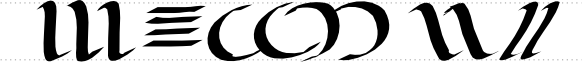
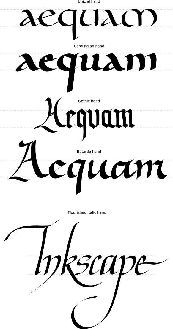
And here are some complete lettering examples:
Conclusion
Calligraphy is not only fun; it's a deeply spiritual art that may transform your outlook on everything you do and see. Inkscape's calligraphy tool can only serve as a modest introduction. And yet it is very nice to play with and may be useful in real design. Enjoy!